Robin O'Connell
Rubik's Cube
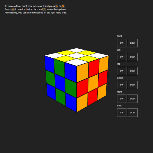
A former coworker (Michael) and I once became mildly obsessed with the challenge of creating and animating a Rubik's cube using CSS (as opposed to, say, a 3D <canvas> like a sensible person would use). We filled several whiteboards with ideas about how it could be done. Eventually, we picked one of those ideas and I sat down and wrote the code. This is the result, which should be viewed not as a practical undertaking but as an exercise in mad science.
See below for a detailed explanation of how it works.
Screenshots
Tools & Technologies
- HTML
- CSS/SASS
- JavaScript
How does it work?
Drawing the cube
First, the cube is divided into 26 smaller "cubelets" (that's 33 - 1 since there is no center cubelet). Each cubelet has 1 face (center), 2 faces (edge), or 3 faces (corner). In HTML terms, a cubelet is a <div> and each face is a <div> nested within. The cubelet is responsible for its position relative to the whole cube while the faces take care of their position and rotation relative to the cubelet.
⚠️ Note that
transform-style: preserve-3dis required for this to work. Without it, instead of the child elements' transforms being composed with those of their parent in 3D space (as you would likely expect), the whole parent element is first rendered to a 2D plane and then its transforms are applied to that plane.
The center of the cube is defined as the point (0, 0, 0). The positive X, Y, and Z axes are taken to point toward the right, top, and front faces of the cube, respectively. (Note that this means the Y axis will be flipped in the CSS.) Cubelets are positioned at -1, 0, and 1 along each axis. A class is created for each position: pos_-1_-1_-1, pos_-1_-1_0, pos_-1_-1_1, and so on up to pos_1_1_1 which applies the appropriate translate3d. For ease, the classes are generated with SASS, and the cubelets are generated with JavaScript, though this isn't necessary.
Each cubelet face has one class that defines its color (.white, .orange, .blue, etc.) and one that defines its local position and rotation (.top, .front, .left, etc.). Each class in the latter group starts with translateX(-50%) translateY(-50%) to center the face on the parent cubelet, which has 0 width and 0 height. This is followed by the particular transformations for that face. For example, a front face requires no rotation, just a translation along the positive Z axis for half the side length of the cubelet. A left face requires a half-side-length translation along the negative X axis and a -90 degree rotation around the Y axis. (In practice, I preferred to rotate first and always apply the translation along the new positive Z axis).
Animating a rotation
A rotation ostensibly alters the position and local rotation of 9 cubelets. The 9 cubelets that comprise the rotating face are grouped into a <div> which is then rotate()ed 90 degrees on the relevant axis. A CSS transition handles the actual animation.
However, this is only done for visual purposes. The next rotation may affect a subset of those 9 cubelets, and moving them from the first rotation's <div> to a new <div> would undo the first rotation. Rather, the effects of the first rotation must be permanently applied to the cubelets.
Persisting rotations
If one was being practical, one would probably store the X, Y, and Z rotations of each cubelet as CSS variables and employ some matrix multiplication to update them after each rotation. However, I contend that this would not be as fun as the approach taken in this project. Our key insight was that the same end state can be achieved by instead rearranging the colored stickers on each face.
At this point, the rotation <div> is deleted and the faces of each affected cubelet are regenerated according to the previous state of the cube and the rotation applied. Note that the actual position and rotation of each cubelet are fixed! In practice, this part requires JavaScript and occurs in four steps:
- Grouping: The cubelets that comprise the rotating face must be gathered together. This is done ahead of time by placing them into 6 non-mutually exclusive arrays (one for each face) as they are created.
- Local rotation: Iterating over the affected cubelets, each cubelet's faces (or stickers) are possibly assigned to different sides of the cube. For instance, consider the top center cubelet as you rotate the front face of the cube counterclockwise. The front-facing sticker remains on the front face, while the top-facing sticker ends up on the left face. All possible transformations are encoded in a map which acts as a function f : (start face, rotation) → end face.
- Translation: Each cubelet's transformed stickers are placed into a 3-dimensional array at the indices corresponding to what its new position would be in a physical model. The new position is calculated by applying a rotation matrix to the cubelet's actual, fixed position. (We didn't escape matrix multiplication after all.)
- Rendering: Finally, each cubelet replaces its actual stickers in the DOM with those stored at its position in the 3D array.
